Intro
Learn to create box plots in Excel, visualizing data distribution with median, quartiles, and outliers, using built-in tools and charts for statistical analysis and data visualization.
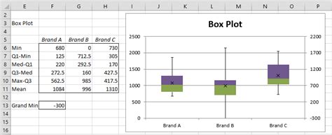
Creating a box plot in Excel is a straightforward process that helps visualize the distribution of data, showcasing the median, quartiles, and outliers. Box plots, also known as box-and-whisker plots, are particularly useful for comparing the distribution of values across different data sets. Here's how you can create a box plot in Excel:
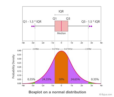
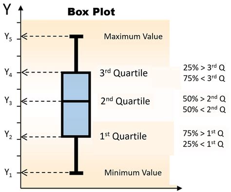
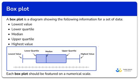
To begin with, understanding what a box plot represents is crucial. A box plot typically displays the following information:
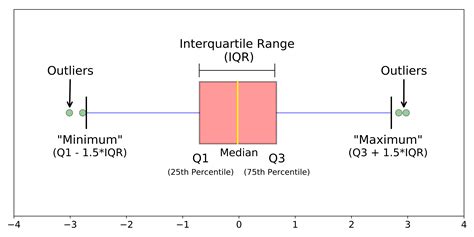
- The box itself represents the interquartile range (IQR), which is the difference between the 75th percentile (Q3) and the 25th percentile (Q1).
- The line inside the box is the median (50th percentile).
- The whiskers extend to a maximum of 1.5 times the IQR from the edges of the box. Data points beyond these whiskers are considered outliers.
Let's create a box plot step by step:
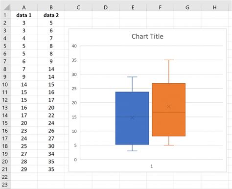
Step 1: Prepare Your Data
Ensure your data is organized in a column or row. For this example, let's assume your data is in column A of your Excel sheet.
Step 2: Go to the "Insert" Tab
Navigate to the "Insert" tab in the ribbon at the top of the Excel window.
Step 3: Click on "Statistical Chart"
In the "Insert" tab, you'll find a section for charts. Click on the "Statistical Chart" button. This button might look like a histogram or a box plot, depending on your version of Excel.
Step 4: Select "Box and Whisker"
From the drop-down menu, select "Box and Whisker." Excel will automatically create a box plot based on your selected data.
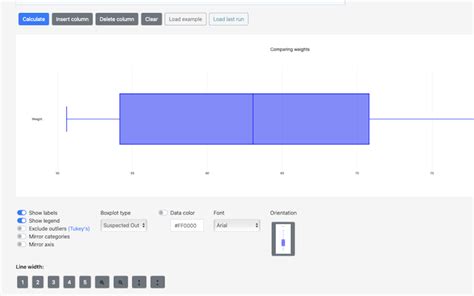
Step 5: Customize Your Box Plot
After creating the box plot, you can customize it as needed. Right-click on the chart and select "Format Data Series" or go to the "Chart Design" and "Chart Format" tabs that appear when you click on the chart. Here, you can change colors, add or remove elements like the axis, gridlines, and more.
Alternative Method for Older Excel Versions
If you're using an older version of Excel that doesn't have the built-in box and whisker chart option, you can create a box plot using the "Excel Analysis ToolPak" add-in or by manually calculating the necessary statistics (median, Q1, Q3, etc.) and then using those values to create a custom chart.
Step 6: Interpret Your Box Plot
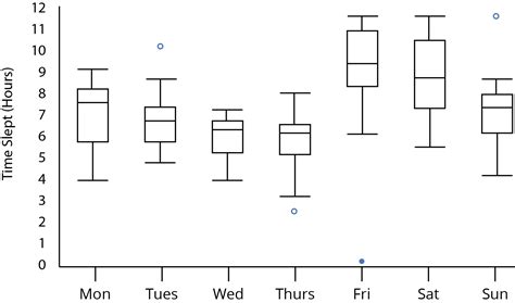
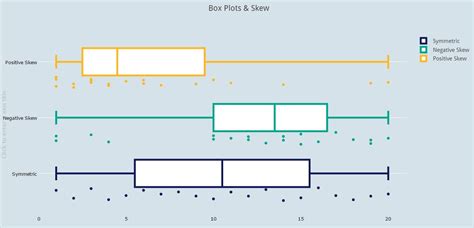
Once your box plot is created, you can interpret the results. Look at the position of the median within the box to understand if the data is skewed. Compare the lengths of the whiskers and the presence of outliers to understand the variability and potential anomalies in your data.

Customizing Your Box Plot
To further analyze your data, you might want to customize your box plot. This could involve adding more data series to compare distributions, changing the chart title, or adjusting the axis labels.
Advanced Customization
For more advanced customization, such as adding jitter to the plot to better visualize overlapping data points or creating a horizontal box plot, you might need to use a combination of Excel's built-in functions and some creative chart manipulation.
Benefits of Box Plots
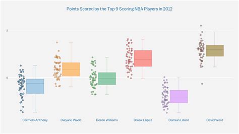
Box plots offer several benefits for data analysis: - **Easy to Understand**: They provide a clear, visual representation of data distribution. - **Comparability**: Multiple box plots can be easily compared side by side. - **Outlier Detection**: They clearly show data points that are significantly different from the rest.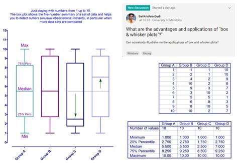
Common Applications
Box plots are used in various fields, including: - **Statistics and Research**: For comparing distributions across different groups. - **Quality Control**: To monitor and compare the performance of different processes or products. - **Finance**: For analyzing stock prices, returns, or other financial metrics.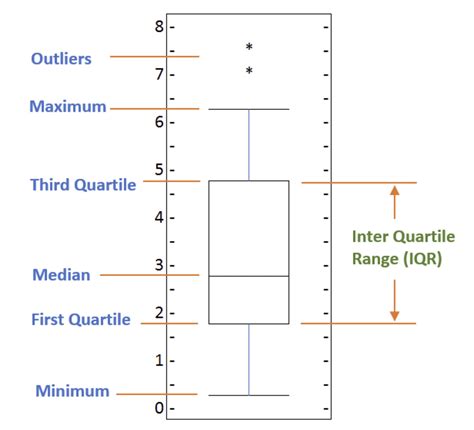
Best Practices
When creating box plots, keep the following best practices in mind: - **Keep it Simple**: Avoid cluttering the plot with too much information. - **Use Colors Effectively**: Especially when comparing multiple data sets. - **Label Clearly**: Ensure all parts of the plot are clearly labeled.
Conclusion and Next Steps
Creating a box plot in Excel is a valuable skill for anyone working with data. By following the steps outlined above and customizing your plots as needed, you can gain deeper insights into your data's distribution and variability. Remember to always keep your plots clear, concise, and well-labeled to effectively communicate your findings.
Box Plot Image Gallery

What is a box plot used for?
+A box plot is used to visualize the distribution of data, showing the median, quartiles, and outliers.
How do I create a box plot in Excel?
+To create a box plot in Excel, go to the "Insert" tab, click on "Statistical Chart," and select "Box and Whisker."
What does the box in a box plot represent?
+The box represents the interquartile range (IQR), which is the difference between the 75th percentile (Q3) and the 25th percentile (Q1).
Can I customize my box plot in Excel?
+Yes, you can customize your box plot by right-clicking on the chart and selecting "Format Data Series" or using the "Chart Design" and "Chart Format" tabs.
What are the benefits of using box plots?
+Box plots are easy to understand, allow for comparability across different data sets, and help in detecting outliers.
We hope this comprehensive guide to creating box plots in Excel has been helpful. Whether you're a seasoned data analyst or just starting to explore the world of data visualization, box plots are a powerful tool that can provide valuable insights into your data. Feel free to share your experiences or ask further questions in the comments below.